✕

Don't stretch or distort the proportions.
uvx --from git+https://github.com/ankaravanas/liberators-brand-mcp lib-brandhttps://mcp.liberators.ai/mcpPositive · on dark Negative · on light
The mark is a luminous ring (orb) with a purple-blue-pink gradient glow, set beside the "Liberators AI" wordmark in a light geometric sans. The ring is the core symbol and may be used on its own as a favicon, app icon or avatar. The glow gradient is the recurring visual signature across every surface.
 Symbol (standalone)
 liberators.ai
Click any swatch to copy its hex. Click the gradient to copy the CSS.
| Token | Role | Where it goes |
|---|---|---|
| Base #0A0A0F | Canvas | Page background on dark surfaces. The default canvas everything sits on. |
| Surface #121218 / #1B1B24 | Raised | Cards, panels, inputs, nav. One or two steps lighter than base. |
| White 100 / 72 / 45% | Text on dark | Headings 100%, body 72%, muted and labels 45%. Never pure-black text on dark. |
| Blue #2F6BFF | Action | THE one action color: primary buttons, links, focus, active, key highlight. Sparingly, only for "do this". |
| Blue bright #5B8BFF | Hover / accent | Hover state of blue, links on dark, icon accents, small numerals. |
| Purple + Pink #A855F7 · #FF5FA2 | Decoration only | Almost never solo. They live inside the gradient. Never as text, buttons or flat fills. |
| Signature gradient #2F6BFF · #A855F7 · #FF5FA2 | Atmosphere | Glows and blooms, dividers, bars, the cover title. Never a flat wash behind content, never on body text. |
| Accent gradient #38BDF8 → #2F6BFF | Text accent | The GFS Didot emphasis word or phrase only (cyan→blue default; warm alt), via background-clip:text, italic. The gradient spans the whole phrase. Never on body copy or headings. |
| Semantic success / warn / danger | State only | Success, warning, danger feedback. Never decorative. |
One blue action, neutral everything else.
Purple or pink buttons, gradient on body text, two competing actions.
Three typefaces, one clear hierarchy. Commissioner does the work. GFS Didot accents an English word or short phrase. Roboto Mono carries the technical detail.
Web: Commissioner Regular 400 is the primary weight: every heading (H1/H2/H3) is 400 at different sizes, letter-spacing -0.045em. Bold (700/800) is reserved for documents and print, never web.
The accent takes a gradient via background-clip (italic). Cyan-to-blue is the default; warm is an alternative.
1 · cyan → blue default
cyan → blue · #38BDF8 → #2F6BFF
2 · blue → purple
blue → purple · #5B8BFF → #A855F7
3 · warm alternative
pink → coral · #FF5FA2 → #FFB580
4 · coral → periwinkle site CTA
coral → periwinkle · #FFA091 → #8DA9FC
Icons come from Phosphor (line weight, white) set in a soft gradient-edge tile. One library, ~9000 glyphs and six weights if we ever need more. The stroke stays light and is never recolored: the tile carries the brand, the glyph stays neutral.
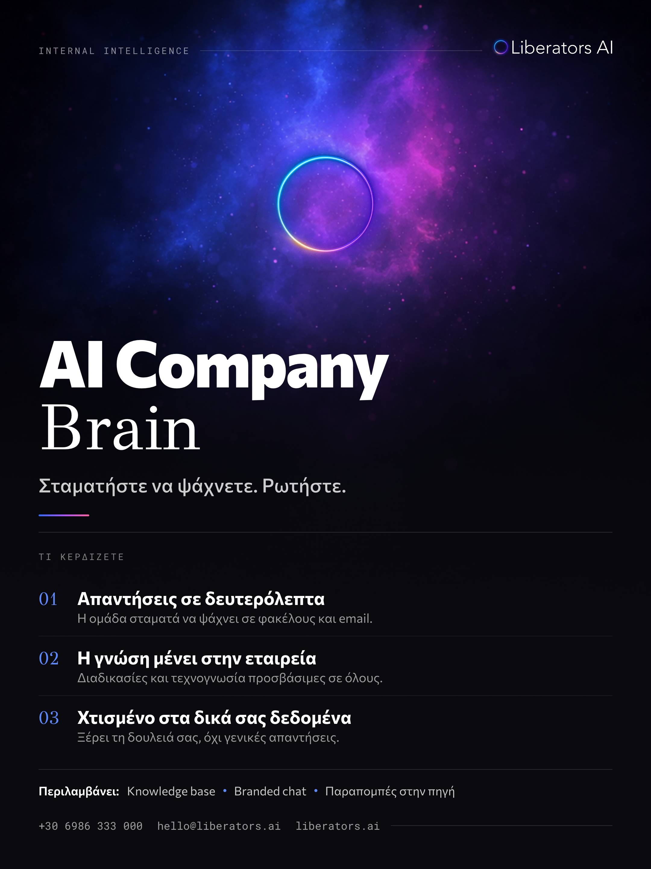
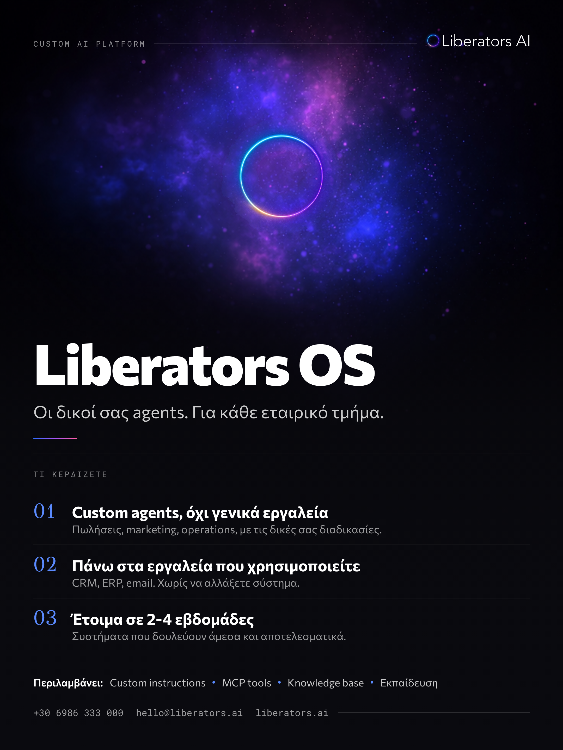
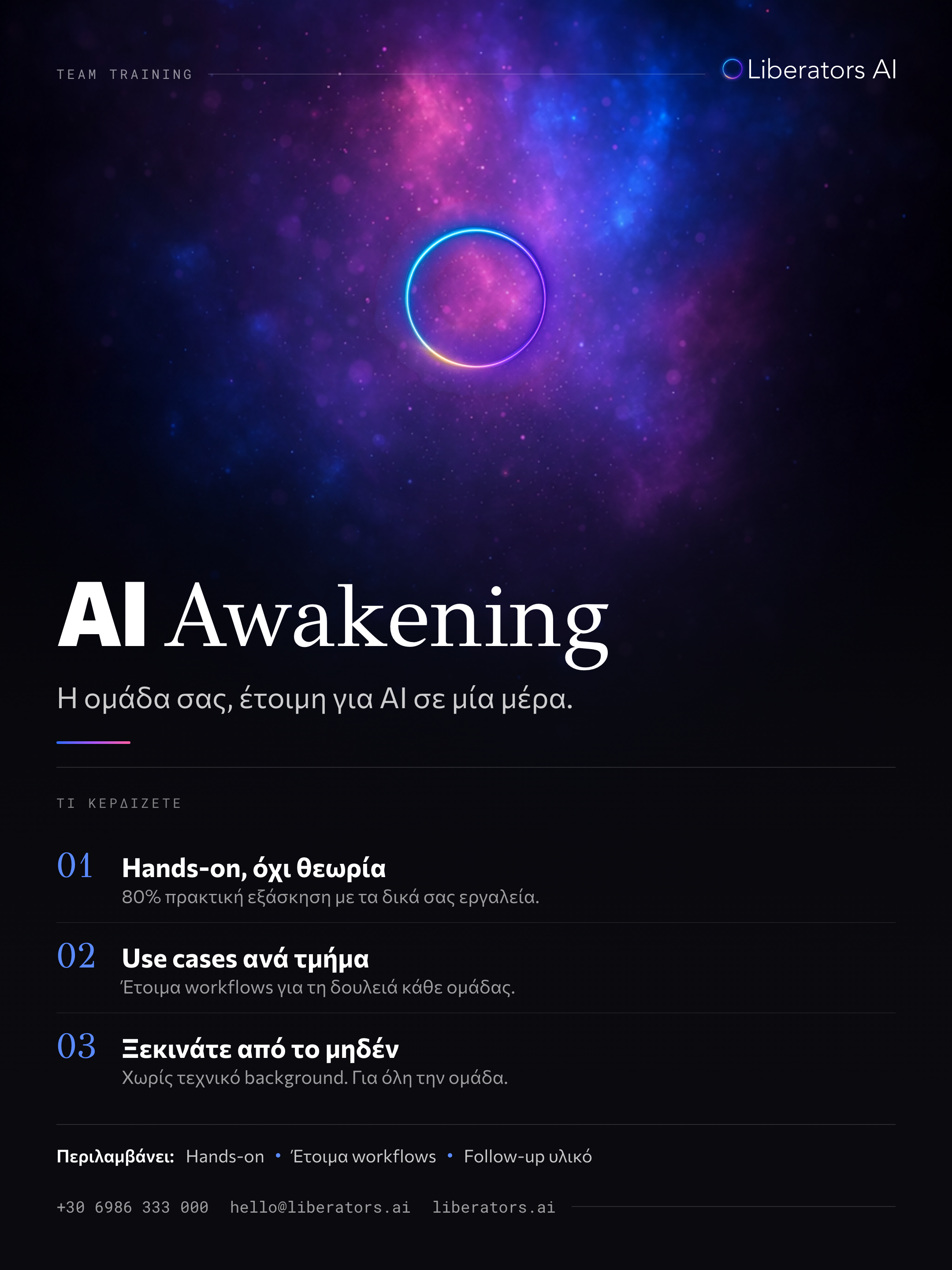
The brand on paper: how proposals and documents are built. One rule governs the surfaces, dark carries the moment, light carries the substance.
The section title carries the message in heavy weight; the continuation drops to light gray. One device on every heading. Above it, a mono uppercase blue eyebrow.
| Phase | Investment |
|---|---|
| SetupBuild and delivery | €6.500 |
| Monthly retainerRun, improve, support | €1.800/mo |
Mono headers, a 2px rule, tabular numerals so figures align. The monthly row tints blue.
The callout is the one place a single sentence gets weight: a blue left rule on a light fill. Used once per page, for the line that matters.
This is the document language: a dark cover with the white to blue gradient title, light content pages, two-weight headings, blue numerals, mono tables and one callout per page. Reuse it across proposals, decks and docs so every page reads as one brand.
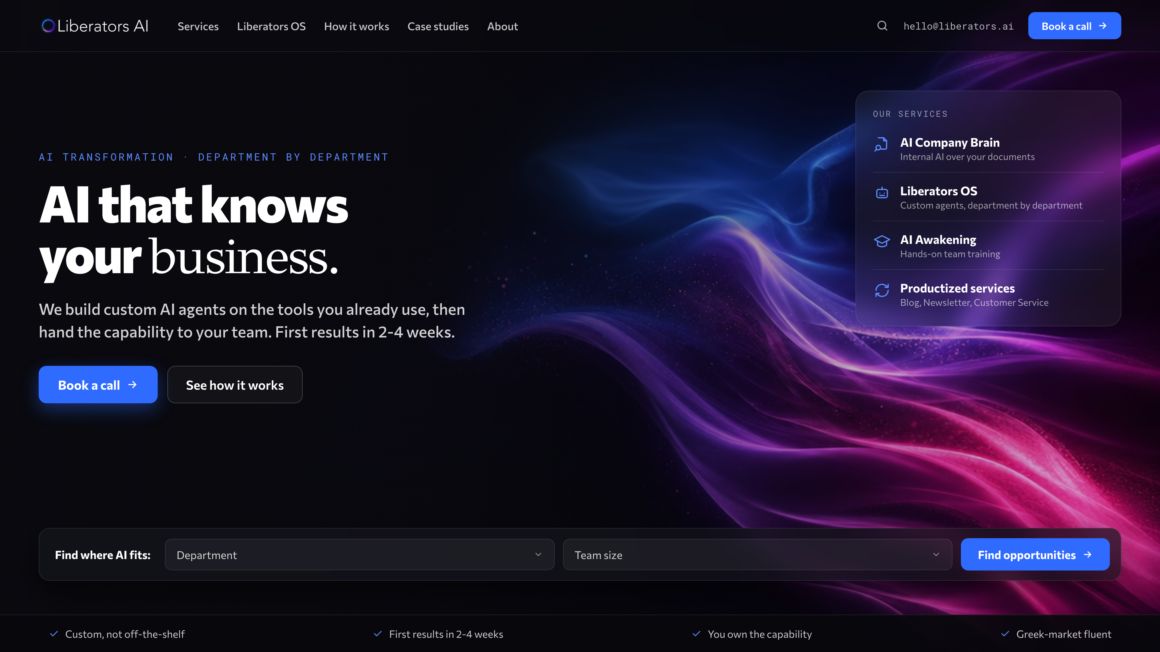
The brand is dark-led, not dark-only. Like every premium AI surface, the site breathes by alternating: dark for the moments (hero, CTA), light for the substance (features, proof, pricing). Same brand, same type, same blue, two surfaces.
On light: ink text, one blue accent, the gradient only as a soft corner bloom or a small highlight (never a heavy wash). Cards sit on white with a soft shadow, not heavy borders. Same Commissioner type, same spacing. Generous whitespace does the premium work.
One primary action per view, in blue. Everything else is a quiet secondary. The primary CTA is the only place the action color becomes a filled button.
The primary CTA ("Book a call") is a pill with a vertical blue gradient; on hover a soft field of white dots fades in behind the label and the button brightens, with no moving border. The secondary ("See how it works") uses a hover-border-gradient: a light running around the border that fills to the full brand gradient on hover. Both stay blue-led, weight 600, pill radius, one primary action per view. The states row shows the primary across default, hover (dots visible), active, focus and disabled.
The starter atoms for product and web, shown on dark (the primary surface). Same tokens, same restraint.
Links are blue and underline on hover. Inputs sit on base with a 1px border and a blue focus ring. Chips are pills, the active one tints blue. Alerts borrow the semantic colors at low opacity. Everything uses the 10px radius and Commissioner type.
The measurements a builder needs so spacing, corners, depth, type and motion stay consistent across the site.
| Token | Size / line | Weight | Use |
|---|---|---|---|
| Display | clamp 48-96px / 1.0 / -.045em | 400 | Hero and cover only |
| H1 | 40px / 1.15 / -.045em | 400 | Section title |
| H2 | 28px / 1.2 / -.045em | 400 | Sub-section |
| H3 | 21px / 1.3 / -.045em | 400 | Card title |
| Body | 16px / 1.6 | 400 | Paragraphs |
| Small / label | 12-13px / 1.4 | 400-500 | Captions, mono labels |
Web headings are all Commissioner Regular 400 at -0.045em tracking. Size carries the hierarchy, not weight. Bold 700/800 is for documents and print only.
| Token | Value | Use |
|---|---|---|
| Micro | 150ms | Hover, button, toggle |
| Standard | 300ms | Cards, panels, fades |
| Reveal | 700ms | Scroll-in sections |
| Easing | cubic-bezier(.16, 1, .3, 1) | All transitions |
| Container | max-width 1080-1200px | Centered, generous side padding |
| Breakpoints | ≤980 tablet · ≤760 mobile | Collapse grids to one column |
The approved lines. English only. Use these; don't rewrite them each time.
| Competitor | Angle | Weakness |
|---|---|---|
| Big4 | Trust + scale | Expensive, slow, presentations not implementation, ignore SMB |
| Freelance AI experts | Cheap, fast | One bot then leave, no strategy or support |
| Software houses | Custom dev | Not AI-native, project-based, slow |
| No-code agencies | Quick automations | Automation without intelligence, shallow |
| Horizontal AI SaaS | Scale, low entry | Generic, doesn't know your business |
| DIY in-house | Control | Stalls after the demo, no integration |
For Greek mid-to-large businesses that want AI inside their daily operations, Liberators AI builds custom AI agents on the tools you already use and gets them running in weeks.
Unlike consultancies that hand over presentations, freelancers who build one bot and disappear, and generic tools that don't know your business: we build it, deploy it, train your team, and leave the capability in your hands.
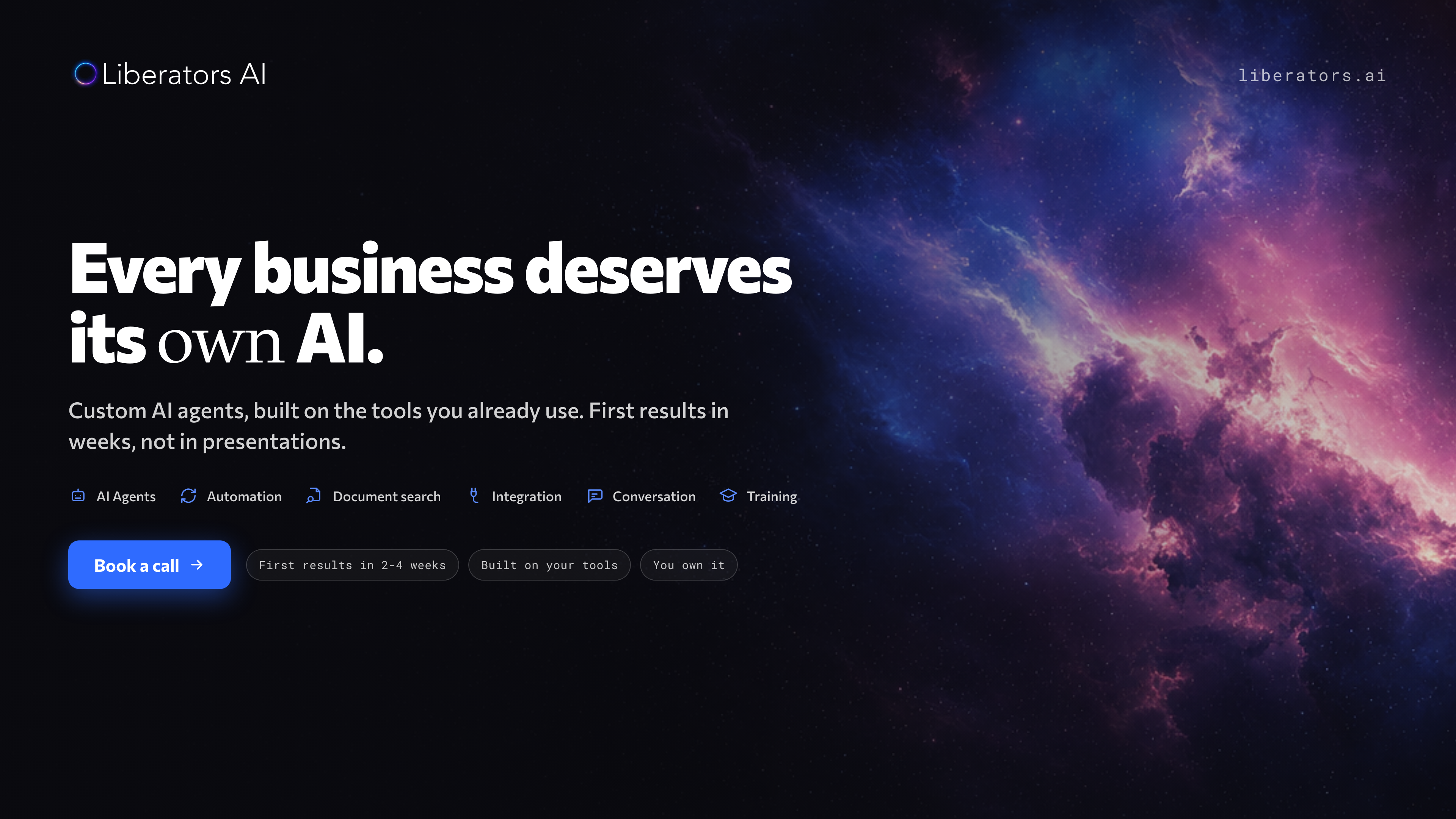
Six brand backgrounds (dark and light), each in 16:9, 4:5 and 9:16 for social, web and ads. Click a tile to preview all sizes, go fullscreen or download.
Serious near-black foundation, generous negative space, one luminous gradient doing the emotional work. Trustworthy technology that is innovative and human. No robots, no glowing brains, no clutter.